Perfect visualization of DFD
Submitted By : Susmita Sen (Department of MCA, Batch : 2016-2019)
Data Flow Diagram:
A data flow diagram (DFD) illustrates how data is processed by a system in terms of inputs and outputs. As its name indicates its focus is on the flow of information, where data comes from, where it goes and how it gets stored.
History of the DFD:
Data flow diagrams were popularized in the late 1970s, arising from the book Structured Design, by computing pioneers Ed Yourdon and Larry Constantine. They based it on the “data flow graph” computation models by David Martin and Gerald Estrin. The structured design concept took off in the software engineering field, and the DFD method took off with it. It became more popular in business circles, as it was applied to business analysis, than in academic circles.
Also contributing were two related concepts:
- Object Oriented Analysis and Design (OOAD), put forth by Yourdon and Peter Coad to analyze and design an application or system.
- Structured Systems Analysis and Design Method (SSADM), a waterfall method to analyze and design information systems. This rigorous documentation approach contrasts with modern agile approaches such as Scrum and Dynamic Systems Development Method (DSDM.)
Symbols and Notations Used in DFDs:
Two common systems of symbols are named after their creators:
- Yourdon and Coad
- Yourdon and DeMarco
- Gane and Sarson
One main difference in their symbols is that Yourdon-Coad and Yourdon-DeMarco use circles for processes, while Gane and Sarson use rectangles with rounded corners, sometimes called lozenges. There are other symbol variations in use as well, so the important thing to keep in mind is to be clear and consistent in the shapes and notations you use to communicate and collaborate with others.
Using any convention’s DFD rules or guidelines, the symbols depict the four components of data flow diagrams.
- External entity: an outside system that sends or receives data, communicating with the system being diagrammed. They are the sources and destinations of information entering or leaving the system. They might be an outside organization or person, a computer system or a business system. They are also known as terminators, sources and sinks or actors. They are typically drawn on the edges of the diagram.
- Process:any process that changes the data, producing an output. It might perform computations, or sort data based on logic, or direct the data flow based on business rules. A short label is used to describe the process, such as “Submit payment.”
- Data store: files or repositories that hold information for later use, such as a database table or a membership form. Each data store receives a simple label, such as “Orders.”
Data flow: the route that data takes between the external entities, processes and data stores. It portrays the interface between the other components and is shown with arrows, typically labeled with a short data name, like “Billing details.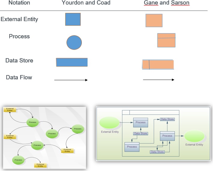
What’s the difference between a logical DFD and a physical DFD?
A logical DFD focuses on the business and business activities, while a physical DFD looks at how a system is implemented. So while any data flow diagram maps out the flow of information for a process or system, the logical diagram provides the “what” and the physical provides the “how.” They are two different perspectives on the same data flow, each designed to visualize and improve the system. The logical DFD describes the business events that take place and the data required for each event. It provides a solid basis for the physical DFD, which depicts how the data system will work, such as the hardware, software, paper files and people involved. In tandem, the logical and physical can fully visualize the current state and model the new state to be considered and then implemented.
Logical DFD
Physical DFD
DFD levels and layers: From context diagrams to pseudo code:
A data flow diagram can dive into progressively more detail by using levels and layers, zeroing in on a particular piece. DFD levels are numbered 0, 1 or 2, and occasionally go to even Level 3 or beyond. The necessary level of detail depends on the scope of what you are trying to accomplish.
- DFD Level 0 is also called a Context Diagram. It’s a basic overview of the whole system or process being analyzed or modeled. It’s designed to be an at-a-glance view, showing the system as a single high-level process, with its relationship to external entities. It should be easily understood by a wide audience, including stakeholders, business analysts, data analysts and developers.
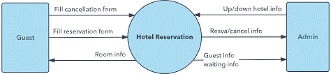
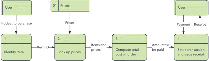
- DFD Level 1 provides a more detailed breakout of pieces of the Context Level Diagram. You will highlight the main functions carried out by the system, as you break down the high-level process of the Context Diagram into its sub processes.
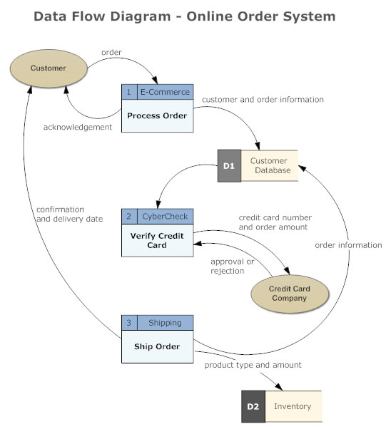
e.g.
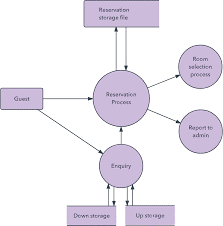
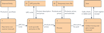
- DFD Level 2 then goes one step deeper into parts of Level 1. It may require more text to reach the necessary level of detail about the system’s functioning.
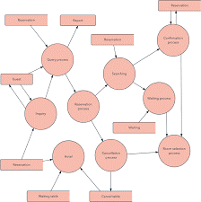
- Progression to Levels 3, 4 and beyond is possible, but going beyond Level 3 is uncommon. Doing so can create complexity that makes it difficult to communicate, compare or model effectively.
Using DFD layers, the cascading levels can be nested directly in the diagram, providing a cleaner look with easy access to the deeper dive.
By becoming sufficiently detailed in the DFD, developers and designers can use it to write pseudo code, which is a combination of English and the coding language. Pseudo code facilitates the development of the actual code.